
To get the non-photographers who visit here up to speed, photo.net is a place for you to see equipment reviews, discuss photography with others, read articles and essays, and most importantly (it seems) get your recent work seen, rated, and critiqued in the hopes of learning what's right and what's wrong with it.
Critiques from a vast variety of sources can be extremely helpful when you want to learn and improve.
The site has a huge membership that is truly world-wide, with often stunning photos coming in from the far reaches of the planet.
The skill level and artistic ability also covers a lot of ground, with a beginner's work having every bit of exposure as a seasoned pro's.
But all is not right in this artistic oasis on the web.
People are starting to freak out about the way the site and it's members are evolving, so I decided to point out what I personally feel are some of the major issues.
(Click to enlarge, or you'll be lost)
Keeping in mind that a critique of a photo is best when served warm, while the details and settings are still fresh in the photographer's mind, I would guess that the only reason this photo was posted recently was to garner high ratings on a 1-7 scale for aesthetics and originality.
High ratings will earn you nothing zero zip nada but ego strokes, while a particularly helpful and insightful critique can turn your life around.
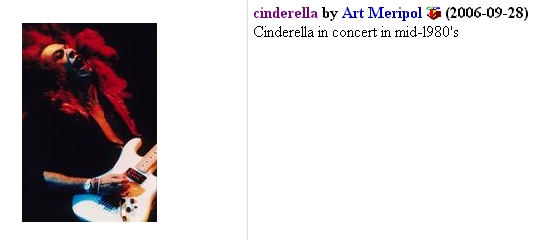
And I have a big problem with people that post photos in the concert section like this. He neglected to spend 30 seconds googling to put a name on the face in his photo. It's NOT a photo of Cinderella. It's Jeff LaBar, who plays lead guitar.
It's disrespectful as hell to use an image of a man to try and further your career without making a tiny effort to learn his name.
Sorry Art, but you're an ass.
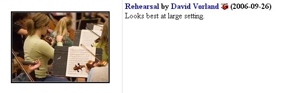
This one is a more minor peeve of mine, but is still worth mentioning.
Because people can (and will) upload photos at wildly different sizes, the site's software automatically re-sizes the displayed version to fit most browser windows.
When the original is bigger than that, a button appears that lets you see the original.
David wants to make damn sure you look at the "best" version, and will possibly ignore comments from anyone who didn't bother to click it a bit bigger.
Fair enough, but all of the real photographers I know take a few extra minutes to figure out what the size limits on a particular website are, and maximize the quality and sharpness of their uploaded photos to display them to their best advantage.
And when a photo is worth a second glance, the first thing us experienced viewers do is look for the "Larger" button, so we don't need to be told.
Or begged.
I'm not exactly afraid that anyone will get upset by these posts, seeing as how the readership here at Z'sG is so small.
But if you see a thumbnail of your work with your name here, please leave a comment (with proof) and I'll delete your shame.
But only if you admit that I'm right...

1 comment:
Hey, I KNOW my photography is bad even without submiting it for a rating. So, no worries here, you can trash the photo.net posters all you want. It's entertaining. :)
Post a Comment